<!DOCTYPE html>
<html lang="en">
<head>
<meta charset="UTF-8" />
<title>Document</title>
<style type="text/css" media="screen">
*{margin:0;padding:0;}
.container{width:200px;height:200px;margin:100px auto;background: linear-gradient(90deg,black 50%,white 50%);border-radius:50%;box-shadow: 0 0 4px #666666;animation:bonce 5s linear infinite;}
.top,.bottom{height: 100px;width: 100px;margin: 0 auto;border-radius: 100px;overflow:hidden;}
.inner1,.inner2{height:50px;width: 50px;margin: 25px auto;border-radius:50%; }
.inner1{background: black}
.inner2{background: white}
.top{background: white}
.bottom{background: black}
@keyframes bonce{
0%{-webkit-transform: rotate(0);
-moz-transform: rotate(0);
-ms-transform: rotate(0);
-o-transform: rotate(0);
transform: rotate(0);}
100%{-webkit-transform: rotate(360deg);
-moz-transform: rotate(360deg);
-ms-transform: rotate(360deg);
-o-transform: rotate(360deg);
transform: rotate(360deg);}
}
</style>
</head>
<body>
<div class="container">
<div class="top">
<div class="inner1">
</div>
</div>
<div class="bottom">
<div class="inner2">
</div>
</div>
</div>
</body>
</html>
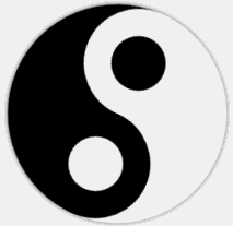
用到了css3的线性渐变animation动画,其中的布局也很巧妙,效果图如下


 CSS3制作旋转的太极图